Things to Avoid When Designing Your Business Cards
There are some dos and don’ts to take into consideration when designing your next business cards. Your card is going to represent your business and of course the quality is going to matter. Remember to keep the following things in mind when designing your business card.
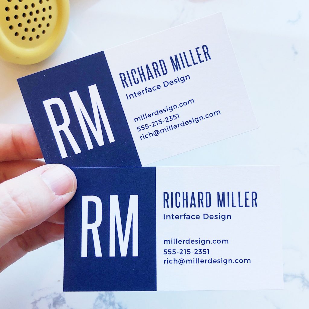
Clear business cards are going to be more beneficial to your business than you may think. You want to make sure the material of your card is going to print nicely. The font you choose needs to be clear and sharp. It is ok to be creative with your cards, but avoid getting too creative with the fonts you use. Some fonts are just very tacky and never want to be used to represent your business on your business cards.
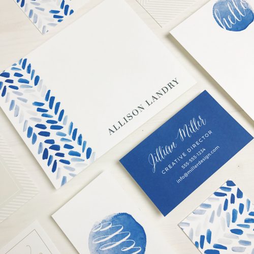
The colors of your business cards are also important. It might be fun to use bright colors, but they usually are not necessary. You can do some different things like use a black background or a different color other than white, just don’t get too crazy with the color choices. Also, the color of your font is going to matter. Obviously, darker colors look great on a white background and lighter colors on a darker background.
You always want to include all of the important contact information about your business on your cards, but be careful with what you are including on your card as you never want to cram too much information on your business card. Of course, you want to avoid any white space, but never fill it with unneeded information or random visuals. This is where a designer will help you layout your business card and edit what you have put together to ensure that you are avoiding any typos as well.
There are many places that can help you design the perfect business card and it can be easy to find the best site for business cards. You can usually get great ideas for your design, but always add your own special flare to it, just remember to avoid these things for the best looking business card for your business.